logo
Wrong email address or username
Incorrect verification code
back to top
Search tags: woman-sleuth
Load new posts () and activity
Like Reblog Comment
review 2014-12-21 04:34
I loved it!!
A Dead Husband (Jessica Huntington Desert Cities Mystery #1) - Anna Celeste Burke

I received a copy of this book “THE DEAD HUSBAND” by Celeste Anna Burke in exchange for a fair and unbiased review. I was pleasantly surprised to find myself lost in the pages of such a wonderful plot. The book is a delightful read filled with a variety of fascinating characters and tons of mystery and suspense for your entertainment.

This is a story of a rich California girl Jessica Huntington, lost in the mist of shopping, socializing, and playing the wife of a cheating husband Jim Harper. On another level Jessica is a smart, witty woman full of energy that would do anything for her friends. She holds a law degree and she takes upon herself to investigate the murder of her best friend’s husband. It does not take long for her to get mixed up in the middle of the chaos and mystery that surrounds that murder.

This is a wonderful novel that will keep you engaged and eager to turn the pages. The author provides a plot full of action, suspense and mystery that will take you on a wild roller coaster, with many twists and turns. She also introduces a delightful assortment of emotions, such as romance, pain, dejection, anxiety, and laughter.

Celeste Anna Burke has a delightful way of writing a story. The storyline of various travels and especially Palm Springs gives the reader a clear picture of the locations and a wonderful sensation that you are actually there. She delivers
a picture of the luxurious playgrounds for the rich, and the wonderful things money can afford you. I found myself quiet emerged into the fascinating and entertaining life that the affluent enjoy day in and day out.

I would recommend this book to anyone who loves mysteries, murder, humor, and thrill. This is really and delightful story that makes a great read.

Source: www.amazon.com/review/R3O0XAT2U9O19I/ref=cm_cr_pr_perm?ie=UTF8&ASIN=B00H870VMU
Like Reblog Comment
photo 2013-10-05 02:40
RISEN (Dark Victorian, Vol. 1) - Elizabeth Watasin
The Dark Victorian: Bones - Elizabeth Watasin
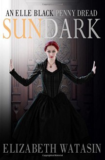
Sundark: An Elle Black Penny Dread - Elizabeth Watasin,JoSelle Vanderhooft
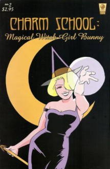
Charm School #2 Magical Witch Girl Bunny - Elizabeth Watasin
Latest event banner with Artifice and Jim Dastard :)

Things: Approved the new Dark Victorian event banner last night, 'n it's being shipped to me already. :-0 I am pretty pleased with myself with coming up with this nice image of Artifice and Jim---pleased enough that I'm thinking (as long as I don't wreck it, I hope!), of taking this lovely 3x7ft banner stand all the way to Phoenix Comic-Con 2014 in June. wooo!


And when I say 'wreck it', it's a retractable banner, and if not handled carefully I could jam it. Or fall on it, or it can fall on me, or I can accidentally kick a hole in it during the tizzy that is maintaining a table at a media convention. Event hijinks!


Regarding Sundark: An Elle Black Penny Dread's paper book, that needs a 2nd proof---interior illustrations (and the story itself) look excellent, the over-saturation on the colour cover, not so much (arrgh). Too much use of a percentage of 'dark' made the printer machine go 'whoopee!' and dump black into everything. But I've adjusted all such dark areas to lighter percentages on the cover file and have re-submitted. If my magicks work, 'twill be ready for Comikaze Expo, SOON.

Am behind on stuff I was planning before foot breakage and medications: a third promo card with Elle Black. I'll try and do that, and also get Charm School #1 and 2 issues ready for the digital formatter. Would a print version be ready by holidays? I would think so (scratches head). If I'd done this before (put together an actual graphic novellette), I'd know if this were a no-brainer or not. What is nice is seeing how great the POD printers can handle interior b/w artwork. Then it's just up to me to layout a graphic novel competently.

I'm not talking about the Charm School omnibus, but the series of 48pp volumes (1 and 2, 3 and 4, etc), that would lead up to the omnibus. I'm doing this more for giving new readers an entry point and letting people fill in ye olde floppy comics set (originally published with SLG Publishing).


And then of course, I must return my attention to the manuscripts, Poison Garden: An Elle Black Penny Dread is still hovering at whatever word count it was last, and Dark Victorian: Everlife needs setting up.


Events! (!!!) Doing Duarte Festival of Authors with the lovely Kate Danley tomorrow (!), then Comikaze Expo, first week of Nov with (TBA---I know who it is, but she hasn't said publicly yet ;) ), and Long Beach Comic-Con a week before Thanksgiving week with the most excellent children's illustrator and soon to have her own title published, Kim Dwinell, and my last event for the year, Loscon 2013, which I may actually appear as Just Me at my table, but I'm rather digging sharing my space with fellow writers and creators, it gives me a bathroom break! ;)


A Happy Fall to all~~~^v^


Like Reblog Comment
show activity (+)
photo 2013-09-28 21:38
last illo in progress for the Sundark: An Elle Black Penny Dread paper book
Detail, last illo in progress for the Sundark: An Elle Black Penny Dread paper book
Throwing out my Victorian Parlour research (we will meet again!)
Detail, 2nd Sundark illustration in the paper book gallery
Sundark: An Elle Black Penny Dread - Elizabeth Watasin,JoSelle Vanderhooft

Seriously, why do I bother putting illustration galleries in the back of my paper books? The less I draw, the more I get to write, I think! Grump! ;-)


Finally, the last illo I want to put in the Sundark gallery is in progress. I have drawn this *6* times. Flipped it, put a new sheet of paper, drawn it 'backwards' on the light table, flipped it again, got a new sheet of paper, drawn it 'forwards'. Repeat. It's finally working, but it just goes to show, when I draw only twice a year, I struggle.

I threw out the parlour layout! After all that research, too, but I still have it in the library of my brain. The centre focus of the parlour was meant to be that scene in Sundark where Elle sits in Faedra's lap and reads a letter to her. If I'd kept the entire parlour layout, they would have been very tiny. A really cozy scene and cute, but then . . .

I am particularly character-driven, so I decided to go with full figures--again. I completely err on the side of not giving backgrounds and I'm trying to be okay with that, especially as the print size is only 5x7'ish. I had gone to 'full' illustrations in Dark Victorian: Bones, depicting scenes like the paper ball throwing incident at the Blue Vanda Cafe. Nice as it was (it wasn't really, I hate perspective), drawing an Indian cafe with Indo-Saracenic architecture, I'd really wanted to zoom in on the characters more.

Again, why draw anymore, I ask myself? I think lots more value and appreciation is placed on photo-manipulated covers and art. People might not even like how I draw my own books (really!). But as long as I still like doing it (sort of---I'm probably just having a grumpy day), they are my books after all. And who draws Victorian ladies sitting in the lap of the other? I want to see that. :D


NEXT: wrapping it all up in Indesign and submitting it for approval with the printer.

More posts
Your Dashboard view:
Need help?