Global warming is the heating up of the planet, with average temperatures rising due to the greenhouse effect of heat-absorbing gases in the atmosphere.

Global warming is the heating up of the planet, with average temperatures rising due to the greenhouse effect of heat-absorbing gases in the atmosphere.
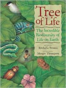
 This book clearly deals with the 'so what' question. There are multiple human and global impacts of biodiversity that make this a relevant book. The book shifts regularly in and out of basic science fact presentation and into social activism. In the end the book gives a dozen examples of specific people and projects that are activists in local, doable ways.
  Let's be clear, this is not a sit down and read cover-to-cover type of picture book. It really is quite dense with information and, if not broken up a bit, it could be super overwhelming. Then you would really be missing all that this wonderful book has to offer. Basically, this serves as an introduction to biodiversity and taxonomy/classification for children (or whoever!). We used it as a springboard to a deeper study of the animal kingdom and, for that purpose, it was just about perfect. I think the information is laid out in a very clear and concise manner. We paired it with [b:One Million Things: Animal Life|5135806|One Million Things Animal Life (One Million Things)|Richard Walker|http://d202m5krfqbpi5.cloudfront.net/books/1347713220s/5135806.jpg|5202690] and found the two books to complement each other nicely.