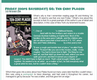
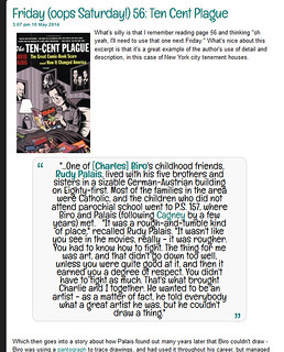
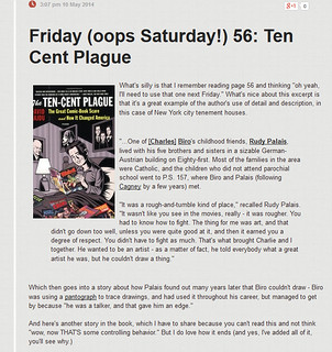
So I took screenshots of what blockquotes look like in the various free themes. I'm going to post a link to this in a thread in the Official Discussion Group, but this post seemed like an easier thing to link to. I've tried to find a "search Discussions" link in there to find out if someone's brought this up already, but there's isn't one, er right? I also did a Find search and a quick google, but can't find that anyone's asked about it. So I'll make a new thread. And add a link to it here, as soon as this posts.
Thread link:
Discussion: Problems with Blockquotes Within Reviews in Booklike's Free Themes
Example images below are linked to Flickr pages with full size screenshots.
1) Bundled (in Chrome)
2) Custom Colors (in Firefox)
3) Gentle Spirit (in Firefox)
4) Smart Casual (in Firefox)
I could be completely happy with so much in Bundled or Custom Colors except I just can't find an easy way to tweak the blockquotes, and background and font color of one (Bundled) and the font choice of the other (Custom Colors) are both a big no for the readability of the text.
Bundled also has problems as far as what choice you make for link colors - it's really easy to have it blend into a background color choice. (Some of this may be my choice of colors - I didn't try many variations to find out. The blockquote problem seemed a bigger issue.)
Something is really odd in Custom Colors because I have my blockquotes all set to align left and not center - and you can see the same text in the Custom Color theme suddenly is center aligned. The others are all left aligned.
While Gentle Spirit and Smart Casual aren't much fun color and font wise - but here's what works:
1) blockquotes are in a clear, readable font, properly set away from the rest of the text, and the align left added in dashboard formatting remains in place.
2) links stand out from the background, are differentiated from regular text and are readable.
Why Blockquotes Matter:
I know a lot of folk may not see quotes as terribly interesting, but for me it's the best way of giving an example of what a book's like. They're the best way you can convince me that a book's writing is as wonderful as you say it is - or as horrible. Using quotes allows the book to speak for itself. And the formatting matters because you want to have a clear indication of the words that aren't yours, but are the author's.
But then I'm also biased because I often post quotes in reviews so I can quickly look them up. It's especially nice when I no longer have access to the book for some reason.

 Log in with Facebook


