logo
Wrong email address or username
Incorrect verification code
back to top
Search tags: Penny-Dread
Load new posts () and activity
Like Reblog Comment
show activity (+)
photo 2014-10-26 00:10
tweaking the ICE DEMON print cover
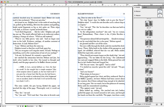
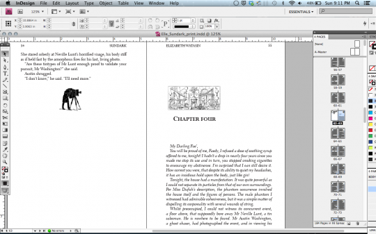
Me, struggling with widows and orphans in Indesign
Ice Demon: A Dark Victorian Penny Dread (The Dark Victorian Penny Dreads Book 1) - Elizabeth Watasin,JoSelle Vanderhooft

. . . made last minute tweaks to the ICE DEMON print cover, and now submitted for 'approval'. Then will order proof. Really hope that background works.


~~~


I need to let go. And I mean I need to let phatpuppy do the entirety of the cover art and me not want to do it (argh, *grabby-hands*), and it's time I handed off formatting. Because the print and e-books could be even sexier in the hands of someone else.


I love making books enough that I'm willing to do book layout (typesetting--well sort of, where I'm concerned)---which is essentially graphic design, a task that doesn't exactly have me jumping up and down with joy. I'm not a graphic designer Jim, I'm an illustrator!


So I'm typing this ( to myself ), to put it out there: hand it away. Take it to the next sexy level. 


All stuff here was made whilst listening to SIA's "Dress In Black".


http://youtu.be/YyN4yrbg_mA

Like Reblog Comment
show activity (+)
photo 2014-10-23 19:31
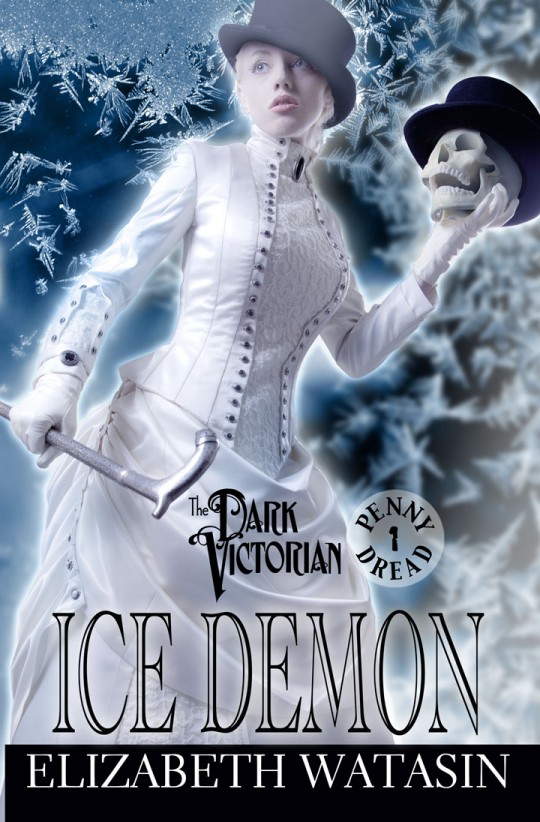
ICE DEMON: A Dark Victorian Penny Dread Vol 1

( I think I'm supposed to connect a 'cover reveal' with an event or a blog tour or something like that. Do I? No! Foolish Elizabeth! But anyway~~~~)


COVER REVEAL! Tra la. STill in 'wait mode' for Release into the wild. Here is the synopsis and then credits. And NOW, ICE DEMON: A Dark Victorian Penny Dread Vol 1:


“Thee, of stars”

A ship of dead with iced men who shatter; The Terror sails into the Port of London during England’s worst winter, bringing insidious ice fog and a hidden killer. Secret Commission agents, Artifice, the artificial ghost, and Jim Dastard, the animated skull, track their murderer to the frozen Thames’ Frost Fair, only for Art to discover a deadlier danger—one involving the women she holds dear. A steampunk, gaslamp and horror mystery set in the world of the Dark Victorian series.

"Smart. Engaging. The fog literally creeps off the page."
– Melanie Karsak, author of the Amazon best-selling steampunk series, The Airship Racing Chronicles


***


Ice Demon: A Dark Victorian Penny Dread Vol 1 will be available SOON. I would like to thank (me), and:
CREDITS
Cover Art by Phatpuppy Creations http://phatpuppyart.com
Cover design and art by Elizabeth Watasin
Cover model is Elizabeth Worth http://www.modelmayhem.com/3122503
Custom Wardrobe Creation: Cavalyn Galano http://www.facebook.com/CavalynDesign
Makeup/Hair: Nadya Rutman http://www.bynadya.com
Photography: Teresa Yeh Photography http://www.teresayeh.com
Dark Victorian Logo: Tom Orzechowski and Lois Buhalis http://serifsup.com/
Editor: JoSelle Vanderhooft http://www.joselle-vanderhooft.com/

Like Reblog Comment
photo 2013-10-05 02:40
RISEN (Dark Victorian, Vol. 1) - Elizabeth Watasin
The Dark Victorian: Bones - Elizabeth Watasin
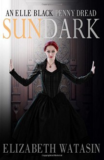
Sundark: An Elle Black Penny Dread - Elizabeth Watasin,JoSelle Vanderhooft
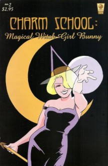
Charm School #2 Magical Witch Girl Bunny - Elizabeth Watasin
Latest event banner with Artifice and Jim Dastard :)

Things: Approved the new Dark Victorian event banner last night, 'n it's being shipped to me already. :-0 I am pretty pleased with myself with coming up with this nice image of Artifice and Jim---pleased enough that I'm thinking (as long as I don't wreck it, I hope!), of taking this lovely 3x7ft banner stand all the way to Phoenix Comic-Con 2014 in June. wooo!


And when I say 'wreck it', it's a retractable banner, and if not handled carefully I could jam it. Or fall on it, or it can fall on me, or I can accidentally kick a hole in it during the tizzy that is maintaining a table at a media convention. Event hijinks!


Regarding Sundark: An Elle Black Penny Dread's paper book, that needs a 2nd proof---interior illustrations (and the story itself) look excellent, the over-saturation on the colour cover, not so much (arrgh). Too much use of a percentage of 'dark' made the printer machine go 'whoopee!' and dump black into everything. But I've adjusted all such dark areas to lighter percentages on the cover file and have re-submitted. If my magicks work, 'twill be ready for Comikaze Expo, SOON.

Am behind on stuff I was planning before foot breakage and medications: a third promo card with Elle Black. I'll try and do that, and also get Charm School #1 and 2 issues ready for the digital formatter. Would a print version be ready by holidays? I would think so (scratches head). If I'd done this before (put together an actual graphic novellette), I'd know if this were a no-brainer or not. What is nice is seeing how great the POD printers can handle interior b/w artwork. Then it's just up to me to layout a graphic novel competently.

I'm not talking about the Charm School omnibus, but the series of 48pp volumes (1 and 2, 3 and 4, etc), that would lead up to the omnibus. I'm doing this more for giving new readers an entry point and letting people fill in ye olde floppy comics set (originally published with SLG Publishing).


And then of course, I must return my attention to the manuscripts, Poison Garden: An Elle Black Penny Dread is still hovering at whatever word count it was last, and Dark Victorian: Everlife needs setting up.


Events! (!!!) Doing Duarte Festival of Authors with the lovely Kate Danley tomorrow (!), then Comikaze Expo, first week of Nov with (TBA---I know who it is, but she hasn't said publicly yet ;) ), and Long Beach Comic-Con a week before Thanksgiving week with the most excellent children's illustrator and soon to have her own title published, Kim Dwinell, and my last event for the year, Loscon 2013, which I may actually appear as Just Me at my table, but I'm rather digging sharing my space with fellow writers and creators, it gives me a bathroom break! ;)


A Happy Fall to all~~~^v^


Like Reblog Comment
show activity (+)
photo 2013-09-28 21:38
last illo in progress for the Sundark: An Elle Black Penny Dread paper book
Detail, last illo in progress for the Sundark: An Elle Black Penny Dread paper book
Throwing out my Victorian Parlour research (we will meet again!)
Detail, 2nd Sundark illustration in the paper book gallery
Sundark: An Elle Black Penny Dread - Elizabeth Watasin,JoSelle Vanderhooft

Seriously, why do I bother putting illustration galleries in the back of my paper books? The less I draw, the more I get to write, I think! Grump! ;-)


Finally, the last illo I want to put in the Sundark gallery is in progress. I have drawn this *6* times. Flipped it, put a new sheet of paper, drawn it 'backwards' on the light table, flipped it again, got a new sheet of paper, drawn it 'forwards'. Repeat. It's finally working, but it just goes to show, when I draw only twice a year, I struggle.

I threw out the parlour layout! After all that research, too, but I still have it in the library of my brain. The centre focus of the parlour was meant to be that scene in Sundark where Elle sits in Faedra's lap and reads a letter to her. If I'd kept the entire parlour layout, they would have been very tiny. A really cozy scene and cute, but then . . .

I am particularly character-driven, so I decided to go with full figures--again. I completely err on the side of not giving backgrounds and I'm trying to be okay with that, especially as the print size is only 5x7'ish. I had gone to 'full' illustrations in Dark Victorian: Bones, depicting scenes like the paper ball throwing incident at the Blue Vanda Cafe. Nice as it was (it wasn't really, I hate perspective), drawing an Indian cafe with Indo-Saracenic architecture, I'd really wanted to zoom in on the characters more.

Again, why draw anymore, I ask myself? I think lots more value and appreciation is placed on photo-manipulated covers and art. People might not even like how I draw my own books (really!). But as long as I still like doing it (sort of---I'm probably just having a grumpy day), they are my books after all. And who draws Victorian ladies sitting in the lap of the other? I want to see that. :D


NEXT: wrapping it all up in Indesign and submitting it for approval with the printer.

Like Reblog Comment
show activity (+)
photo 2013-09-16 18:22
picking an Ex Libris for Sundark
Title page for Sundark
(still awaiting the Library of Congress assigned number :) ).
making the decision to drop in spot illos
(might be getting overindulgent on the spot illos)
SPOT MY FLEURON! :D
Sundark: An Elle Black Penny Dread - Elizabeth Watasin,JoSelle Vanderhooft

The Art of laying out a Print Book:


Sundark: An Elle Black Penny Dread will be the third book I've laid out for print, and I think I may get the hang of this art form. ;) Because it is an art form, just one we've taken for granted so much that we forget that behind a well presented medium are tried and true, long time aesthetics. 'The Golden Mean' for one, for those who know their graphic design. The page of a book is all about that.


And I am no graphic designer! But after looking at the galleries of some book formatting outfits online, some of whom I had hoped had actually typeset in the past (the art of laying out a book for print with---well, TYPE), I was not digging their 'one size fits all modern fiction' approach. I wanted the Dark Victorian series to look like classic fiction and have 'old' elements of design; an inclusion of fleurons, for one (with both Risen and Bones I may have indulged in a few too many fleurons---I am not a graphic designer! ;D). For the Elle Black Penny Dreads, which I think keeps in the tradition of pulp adventure novels, I'm dropping in vintage spot illustrations. Very tiny! But like my discovery of fleurons, I am erring on the side of control-freak creator in some of my choices. For one, the last screenshot of Chapter Eight? That is a spot illo of a loo. I don't believe there's any publisher who would allow their graphic designer to put something like that in a serious book. In my case, I consider it a lovely ironic statement.


Against all good sense, I'm leaving it in. :D


In order to learn the aesthetics of book layout I did consult a book. IF there's only one book one can get, it's Book Design and Production: A Guide for Authors and Publishers, by Peter Masterson. Herein lies all the 'olde' knowledge descended from having blackened one's fingers with ink and cradled blocks of type in the hand. After that, I looked through all my fiction books to find the ones whose aesthetics I thoroughly enjoyed---and that's a front to back example of solid aesthetics, from the indicia page to a chapter's interior. The book I found myself returning to the most? The hardcover version of Melissa Marr's Wicked Lovely. (The 'extras' bit in the back, however, looked like they were laid by another hand---and badly).


I'll profess a third time, I'm not a graphic designer. But with a willingness to learn and imitate, I can lay out something decent. And perhaps with a little bit of fun thrown in.


Returning to it! I'm not done yet, because now I need to include something that no one cares to add to print books anymore--at least not for the last few decades. Some illustrations. :) More, later.


More posts
Your Dashboard view:
Need help?